
Element Template Chooser
The BPMN Modeler extension includes a custom element template chooser that lets you browse, search, filter, preview, and apply Camunda Element Templates directly from the properties panel.
Usage
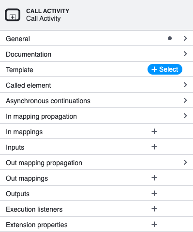
- Select a BPMN element on the canvas (e.g. a Call Activity or Service Task).
- In the properties panel, locate the Template section and click the + Select button.
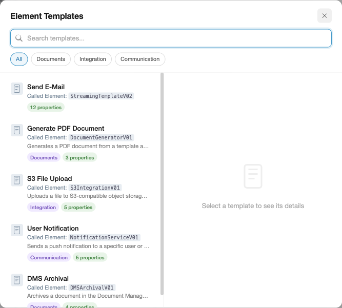
- The chooser overlay opens, listing all element templates that match the selected element type.
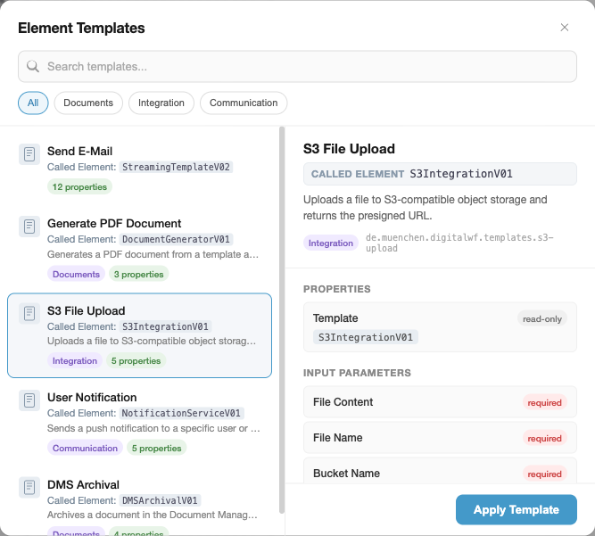
- Click a template to see a detailed preview on the right, then click Apply Template to apply it.
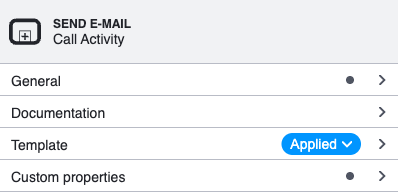
- After applying, the properties panel updates to show the template name and an Applied badge.
UI Overview
The chooser is a centered modal overlay with a backdrop blur effect. It uses a split layout:
| Area | Description |
|---|---|
| Header | Title ("Element Templates") and close button. |
| Search bar | Instant text search across template name, description, category, and keywords. A clear button appears when text is entered. |
| Category chips | Filter chips derived from the category field of loaded templates. Click a chip to filter; click again (or "All") to reset. |
| Template list (left) | Scrollable list of matching templates. Each card shows an icon, name, implementation detail (topic/delegate/called element), description, category badge, and property count. |
| Preview panel (right) | Detail view of the selected template: name, implementation detail, description, documentation link, template ID, and categorised parameter lists (Properties, Input Parameters, Output Parameters). Each parameter shows its label, required/read-only/optional badges, description, and default value. |
| Apply button | Appears in the preview footer. Applies the template to the selected element and closes the overlay. |
Keyboard Navigation
| Key | Action |
|---|---|
Arrow Down / Arrow Up | Move selection through the template list |
Enter | Apply the currently selected template |
Escape | Close the overlay without applying |
Double-clicking a template in the list applies it immediately.
Implementation Detail
Templates that define a well-known implementation binding display it prominently — both on the template card and in the preview header. This makes it easy to identify what a template connects to at a glance, without expanding the properties.
The following binding names are recognised (checked in priority order — the first match is displayed):
| Binding Name | Label in UI | Typical Use Case |
|---|---|---|
camunda:topic | Topic | External task pattern |
camunda:delegateExpression | Delegate | Java delegate expression |
camunda:class | Java Class | Java class implementation |
camunda:expression | Expression | Expression-based implementation |
calledElement | Called Element | Call activity (subprocess invocation) |
For example, an external task template with "binding": { "type": "property", "name": "camunda:topic" } and "value": "createAndUpdateWorkingTimes" will show Topic: createAndUpdateWorkingTimes on both the card and the preview header.
The implementation detail is only shown when the property has a non-empty value. Templates without any of these bindings simply omit the line.
Filtering in Detail
The chooser provides two complementary filtering mechanisms that can be combined.
Text Search
The search bar at the top of the modal performs instant, case-insensitive substring matching. It searches across multiple fields of each template simultaneously:
name— the display name (e.g. "Send E-Mail")description— the template description textcategory.name— the category label (e.g. "Communication")keywords[]— optional keyword array from the template JSON
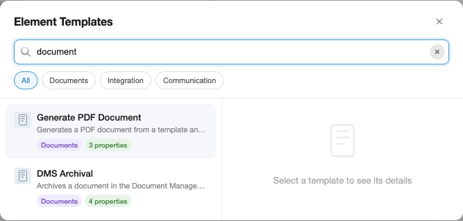
Typing "document" matches both "Generate PDF Document" and "DMS Archival" (whose description contains "document"):
The clear button (x) resets the search and refocuses the input for a fresh query.
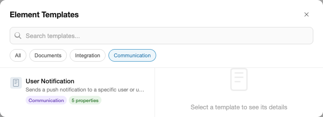
Category Filter
Category filter chips appear automatically below the search bar when at least one loaded template has a category field. The chips are derived dynamically from the templates — no configuration needed.
- Click a category chip to show only templates in that category.
- Click the same chip again, or click All, to remove the filter.
- Category and text search combine: if "Communication" is active and you type "mail", only communication templates matching "mail" are shown.
Filtering Precedence
Filters are applied in this order:
- Category — if a category chip is active, templates without that category are excluded.
- Text search — the remaining templates are further filtered by the search query.
Both filters reset independently: clearing the search does not reset the category, and vice versa.
How to Create Good Element Templates
Element templates are JSON files that define reusable configurations for BPMN elements. A well-structured template improves discoverability in the chooser and reduces configuration errors for users.
File Location
Place template files as .json files under <configFolder>/element-templates/ (default: .camunda/element-templates/). The extension discovers templates hierarchically from the BPMN file's directory up to the workspace root, so you can scope templates to specific subdirectories or share them project-wide.
my-project/
├── .camunda/
│   └── element-templates/
│       ├── send-email.json          # available to all BPMN files
│       └── generate-pdf.json
├── processes/
│   ├── .camunda/
│   │   └── element-templates/
│   │       └── special-task.json    # only for files in processes/
│   └── my-process.bpmn
Template Structure
A minimal template requires name, id, appliesTo, and properties:
{
    "$schema": "https://unpkg.com/@camunda/element-templates-json-schema/resources/schema.json",
    "name": "Send E-Mail",
    "id": "com.example.templates.send-email",
    "appliesTo": ["bpmn:ServiceTask"],
    "properties": []
}
Metadata That Improves Discoverability
The chooser UI leverages several optional fields to help users find and understand templates. Include as many as applicable:
| Field | Effect in Chooser |
|---|---|
name | Displayed as the card title and preview heading. Keep it short and descriptive. |
description | Shown below the name in the template list and at the top of the preview panel. Describe what the template does, not how. |
category | Generates a filter chip and a colored badge on the card. Group related templates (e.g. "Communication", "Integration", "Documents"). |
documentationRef | Rendered as a clickable "Documentation" link in the preview. Point to a wiki page, README, or API docs. |
keywords | Included in text search matching but not displayed. Add synonyms or abbreviations users might search for (e.g. ["smtp", "notification"] for an email template). |
icon.contents | Displayed as a small icon on the template card. Use a data URI for an SVG or PNG. |
Writing Good Properties
Properties define the input fields, output mappings, and hidden bindings that the template applies. Follow these guidelines:
Always set label — it is displayed in the preview panel and in the properties panel after applying. A property without a label appears as the binding name, which is often cryptic.
Add description for non-obvious fields — the preview panel shows descriptions below the parameter name. This helps users understand what value to provide without leaving the modeler.
Mark required fields with constraints.notEmpty: true — the chooser shows a red "required" badge for these, and the properties panel validates them after applying.
Use editable: false for fixed values — fields like implementation class names or called element IDs that should not be changed get a "read-only" badge in the preview. This signals to users that the value is intentional.
Set meaningful default values — the preview panel shows default values in a monospace code block. Good defaults reduce the number of fields users need to fill in after applying.
Use type: "Hidden" for technical bindings — properties with type: "Hidden" are excluded from the preview panel and the visible property count on the card. Use this for delegate expressions, implementation types, and other values that users should not modify.
Example: A Well-Structured Template
{
    "$schema": "https://unpkg.com/@camunda/element-templates-json-schema/resources/schema.json",
    "name": "Send E-Mail",
    "id": "com.example.templates.send-email",
    "description": "Sends an email via the company SMTP gateway.",
    "documentationRef": "https://wiki.example.com/email-integration",
    "appliesTo": ["bpmn:ServiceTask"],
    "category": {
        "id": "communication",
        "name": "Communication"
    },
    "keywords": ["smtp", "notification", "mail"],
    "properties": [
        {
            "type": "Hidden",
            "value": "${emailDelegate}",
            "binding": {
                "type": "property",
                "name": "camunda:delegateExpression"
            }
        },
        {
            "label": "Recipient",
            "description": "Email address or process variable (e.g. ${assignee})",
            "type": "String",
            "binding": {
                "type": "camunda:inputParameter",
                "name": "recipient"
            },
            "constraints": { "notEmpty": true }
        },
        {
            "label": "Subject",
            "type": "String",
            "binding": {
                "type": "camunda:inputParameter",
                "name": "subject"
            },
            "constraints": { "notEmpty": true }
        },
        {
            "label": "Body",
            "description": "Supports Freemarker expressions: ${variableName}",
            "type": "Text",
            "binding": {
                "type": "camunda:inputParameter",
                "name": "body",
                "scriptFormat": "freemarker"
            },
            "constraints": { "notEmpty": true }
        },
        {
            "label": "Send Result",
            "description": "Process variable that receives the send status",
            "type": "String",
            "value": "emailSentStatus",
            "binding": {
                "type": "camunda:outputParameter",
                "source": "${sendStatus}"
            }
        }
    ]
}
In the chooser, this template would show:
- Card: "Send E-Mail" with description, "Communication" badge, "4 properties" count (the Hidden property is excluded)
- Preview: name, description, documentation link, category badge, template ID, then Properties (none visible), Input Parameters (Recipient required, Subject required, Body required with description), Output Parameters (Send Result with default value
emailSentStatus)
For implementation details, see Contributing → Element Template Chooser internals.